I'm open to new opportunities.
If you're looking to connect, let's grab a coffee and chat!
Here's some of what I'm listening to →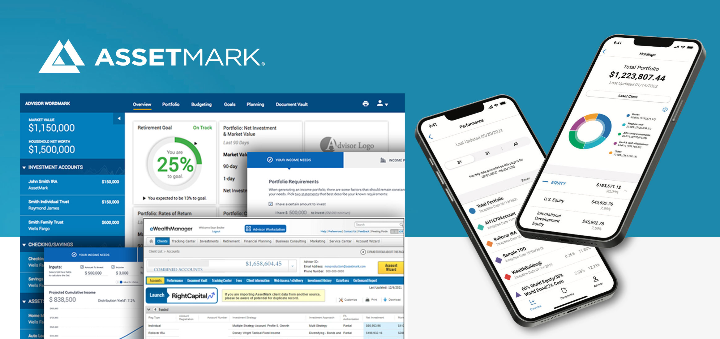
Transforming AssetMark's Product Development Through Unified Design & Establishing UI Foundations For The Leading Independent Wealth Management Platform
Assetmark had over $160 billion in platform assets as of October 2025 after the acquisition by GTCR. Many new companies and firms were brought under the Assetmark umbrella and needed an alignment of design and technology. The company was taken private by GTCR to focus on expanding its client offerings in wealth management and technology. I was tasked to take all the various technologies and tools being used across the companies and create a system and foundation all teams new and old can align on to create a cohesive experience for users, business teams, sales teams, and technology teams.
Establishing UI Foundations for the leading independent Wealth Management Platform
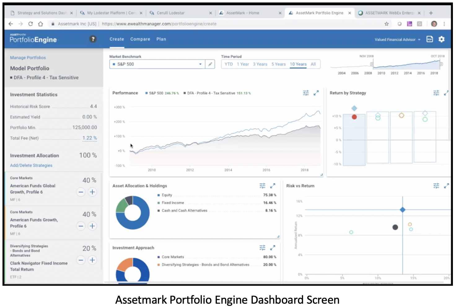
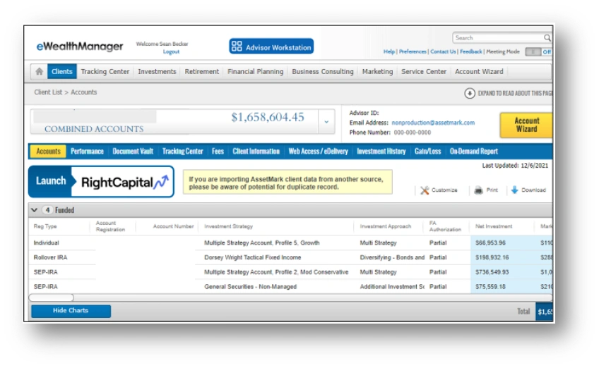
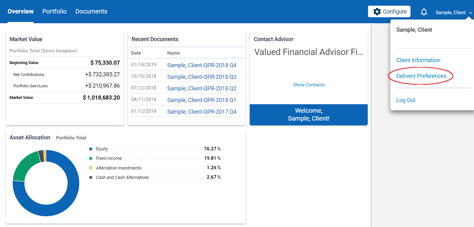
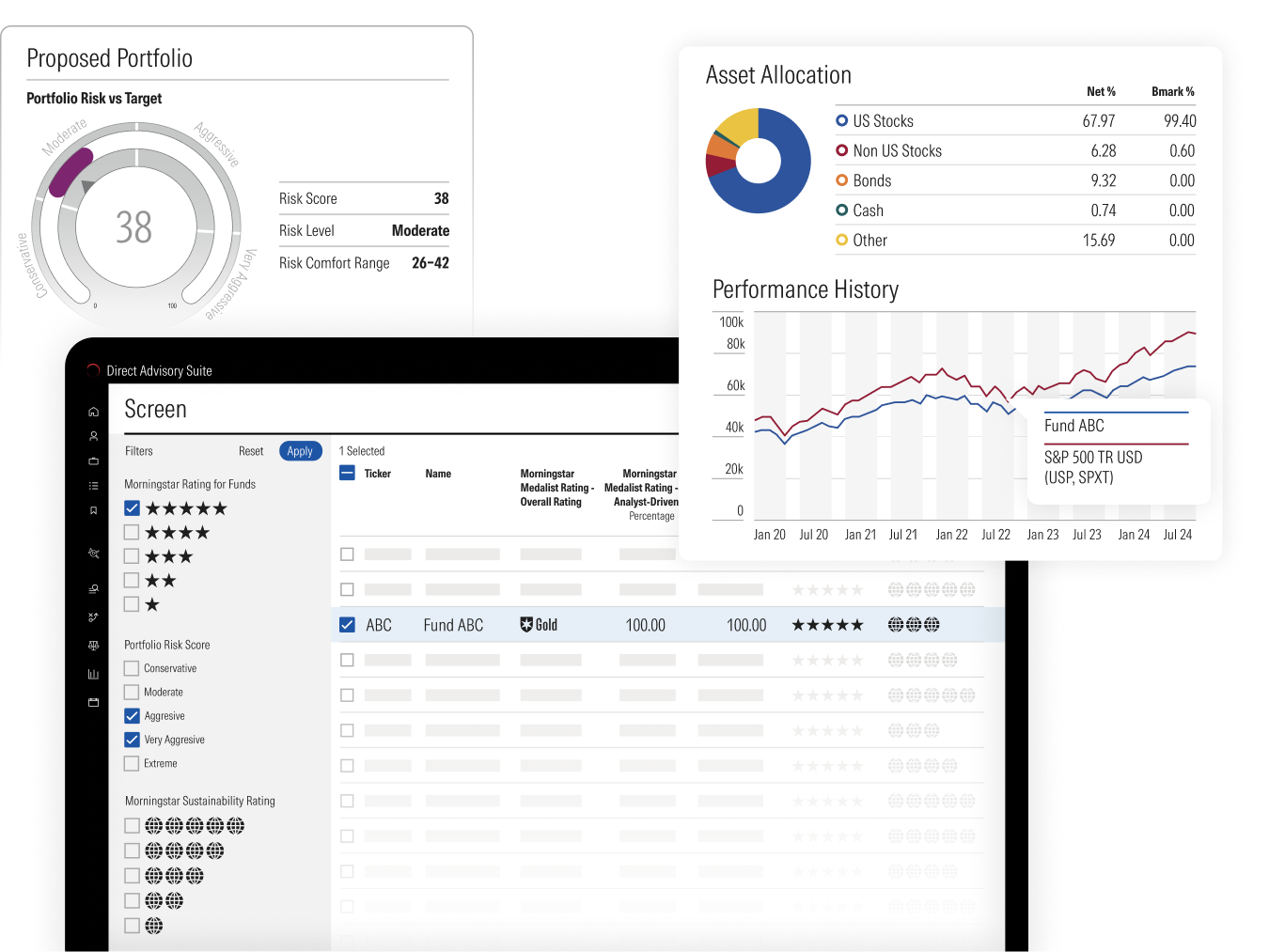
AssetMark creates a financial advisor tech stack, which is a set of software or apps a financial advisor uses for back-office operations or client-facing activities to manage investments, financial services, the business, or even client meetings. These digital solutions may be integrated working together or be used separately.
AssetMark's rapid growth led to a fragmented design ecosystem that was hindering innovation and user experience.
AssetMark, a leading wealth management platform, faced the common challenge of maintaining design consistency and optimizing development efficiency across its rapidly expanding suite of digital products. With multiple product design and engineering squads working independently, the need for a unified Digital Design System (DDS) became paramount to ensure a cohesive customer experience and accelerate feature delivery.
50+ unique button variants across products, No Governance
75% of dev time spent on repetitive UI work
Technical debt accumulating faster than features
Designers and developers working in silos 80% Defects from not aligning on Design
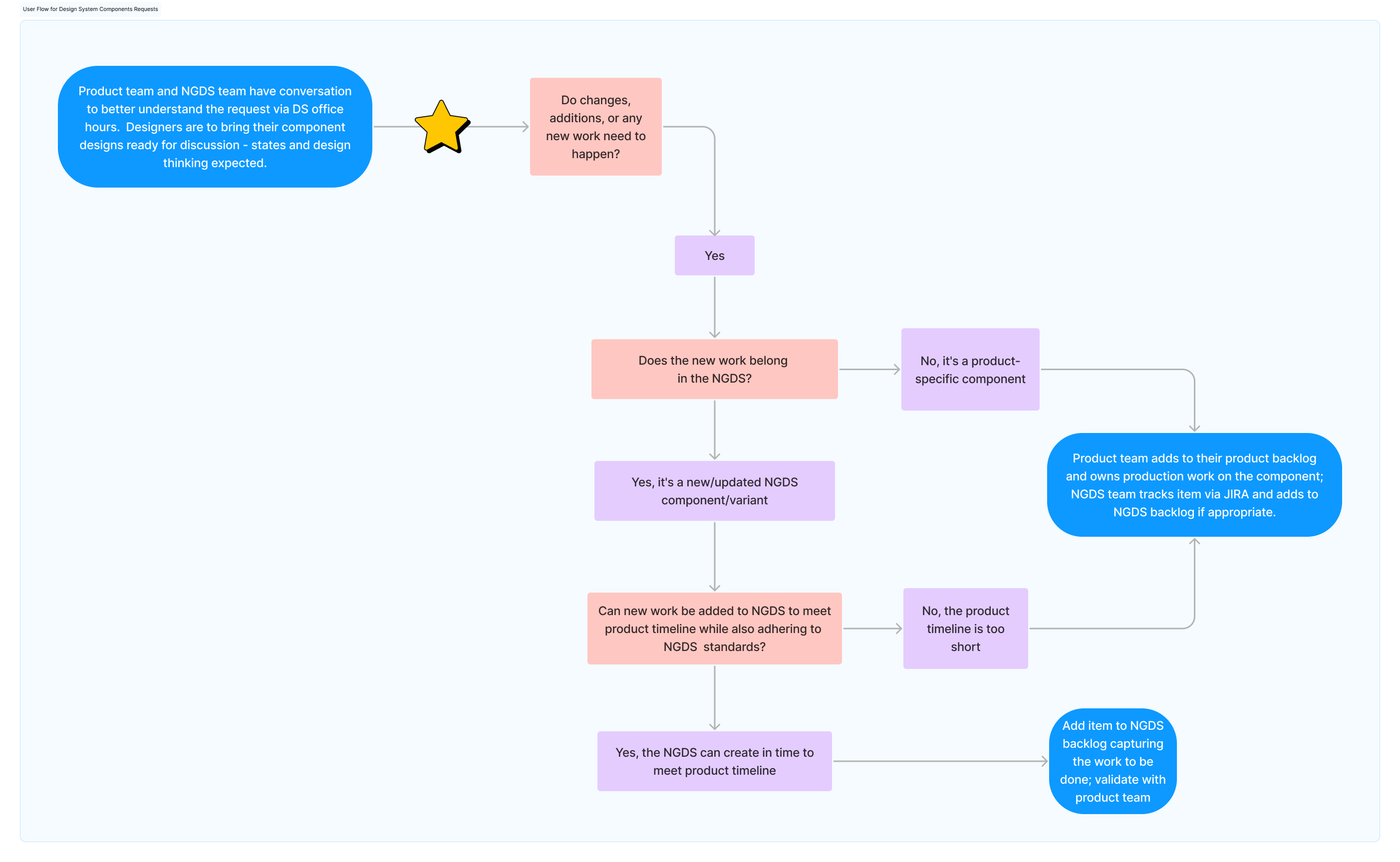
Each product and tech stack had its own teams and silos of PM, Design, and Engineering teams that all were creating their own designs and had no governance to maintain the same user experience across products. This resulted in the user going from Legacy pages using designs common in the 90s to screens designed using different fonts, colors, and tech, and then back to the older experience as it looked when the company was getting started in the late 90s.
As the Lead Design Systems Product Design Development Manager at AssetMark, I owned the strategic evolution and implementation of the Digital Design System. My mission was to bridge design and engineering, creating a single source of truth for all UI components and patterns.
I provided design leadership and strategic guidance to over 5 product design and 10 engineering squads. This involved ensuring alignment on digital product initiatives and fostering a collaborative environment that prioritized the cohesive development of all web and native mobile applications.
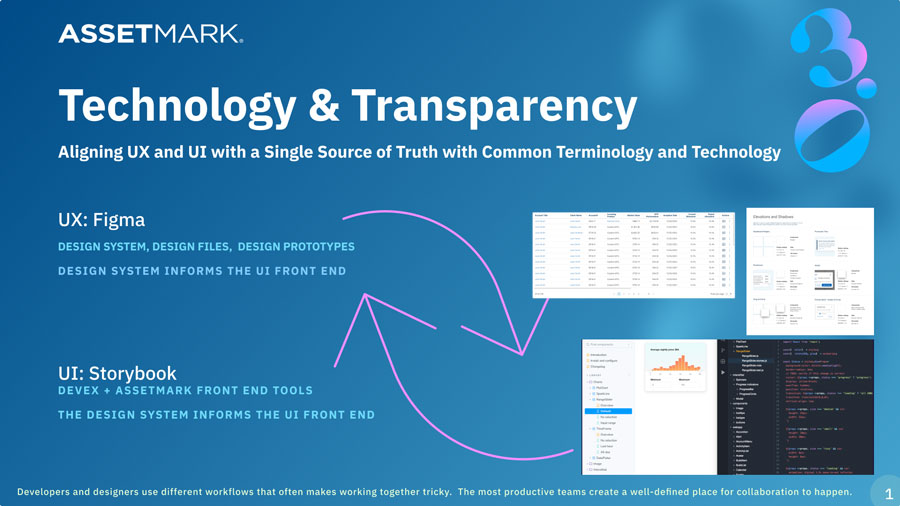
I owned and evolved the DDS within core design and development tools like Figma (for design artifacts) and Storybook (for coded UI component documentation). This involved leading the product design, UI, and UX for multiple unique applications from concept through launch, with a focus on building a scalable system.
A core part of my role was to streamline the design process. By implementing new workflows and optimizing existing ones, we achieved significant improvements in efficiency.
I actively contributed front-end development support (HTML, CSS, JavaScript, Tailwind) during technical implementation and QA to ensure pixel-perfect fidelity.
Months 1-2
Comprehensive audit of existing components, user research, and stakeholder interviews to understand pain points and requirements.
Months 3-5
Established design tokens, core principles, and built the first set of atomic components with comprehensive documentation.
Months 6-8
Created React component library, established CI/CD pipelines, and integrated with existing development workflows.
Months 9-12
Migrated pilot projects, trained teams, established governance processes, and measured impact across the organization.
Seamlessly integrated into existing development processes without disrupting productivity.
Figma components automatically sync with code components, ensuring 1:1 parity.
Pre-built, tested components reduce development time by 40% on average.
Automated testing and accessibility checks built into every component.
Data-driven results that transformed our development velocity and user experience. The implementation and strategic evolution of AssetMark's Digital Design System yielded significant, measurable improvements across the organization:
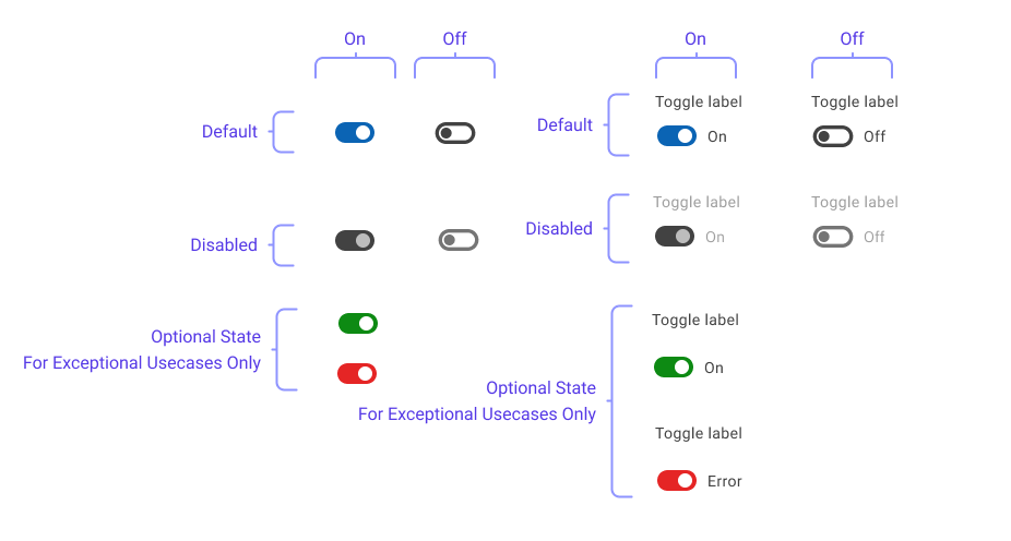
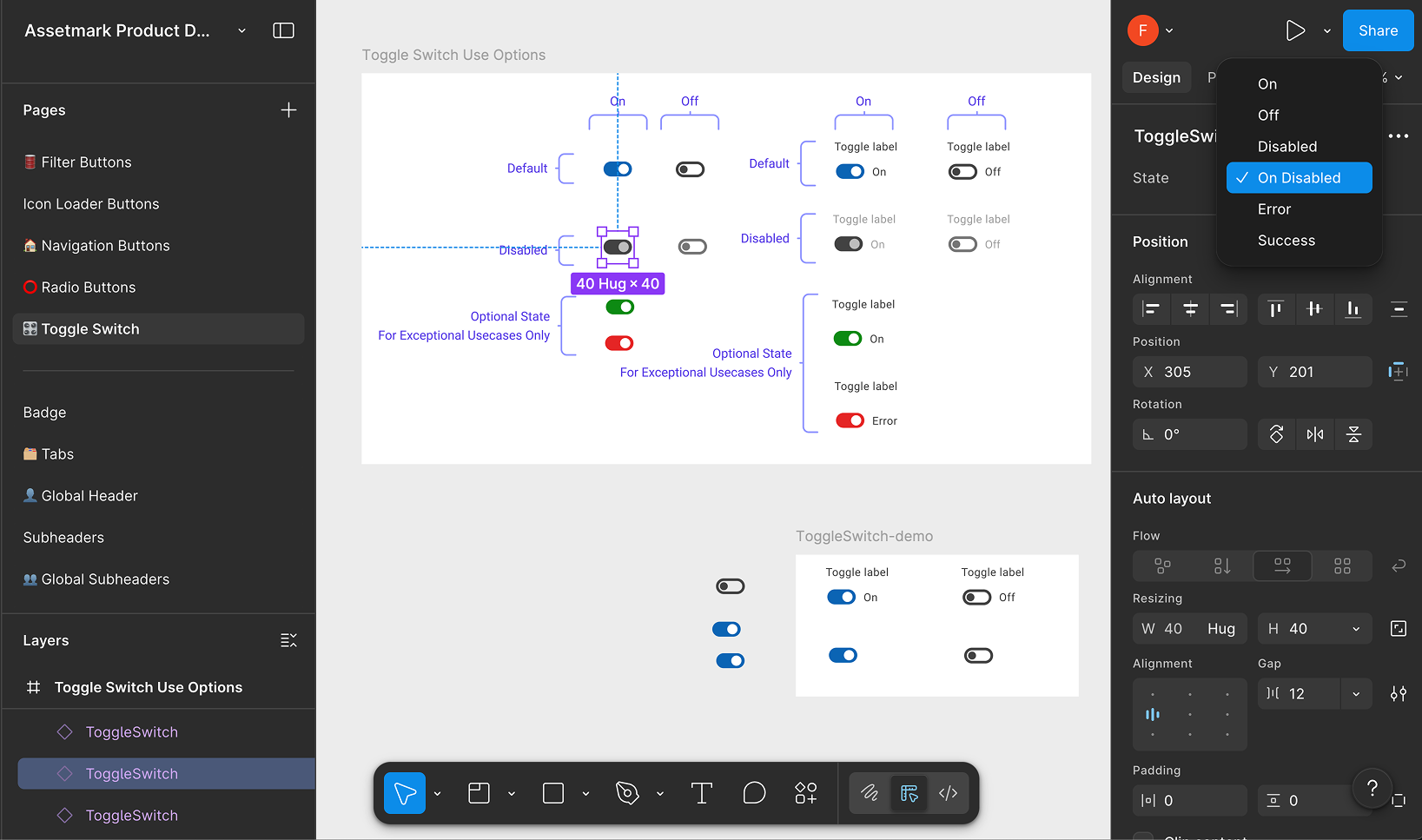
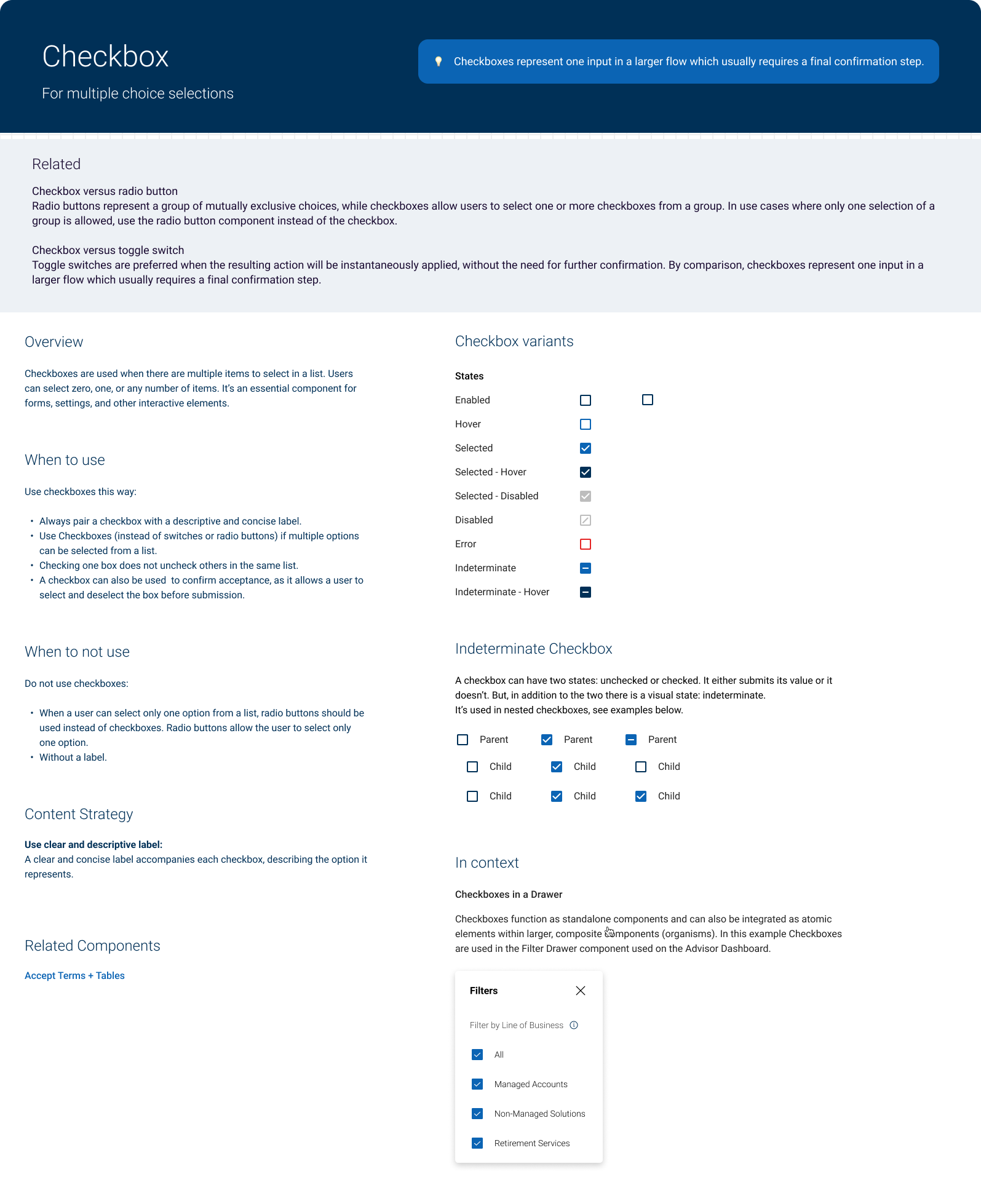
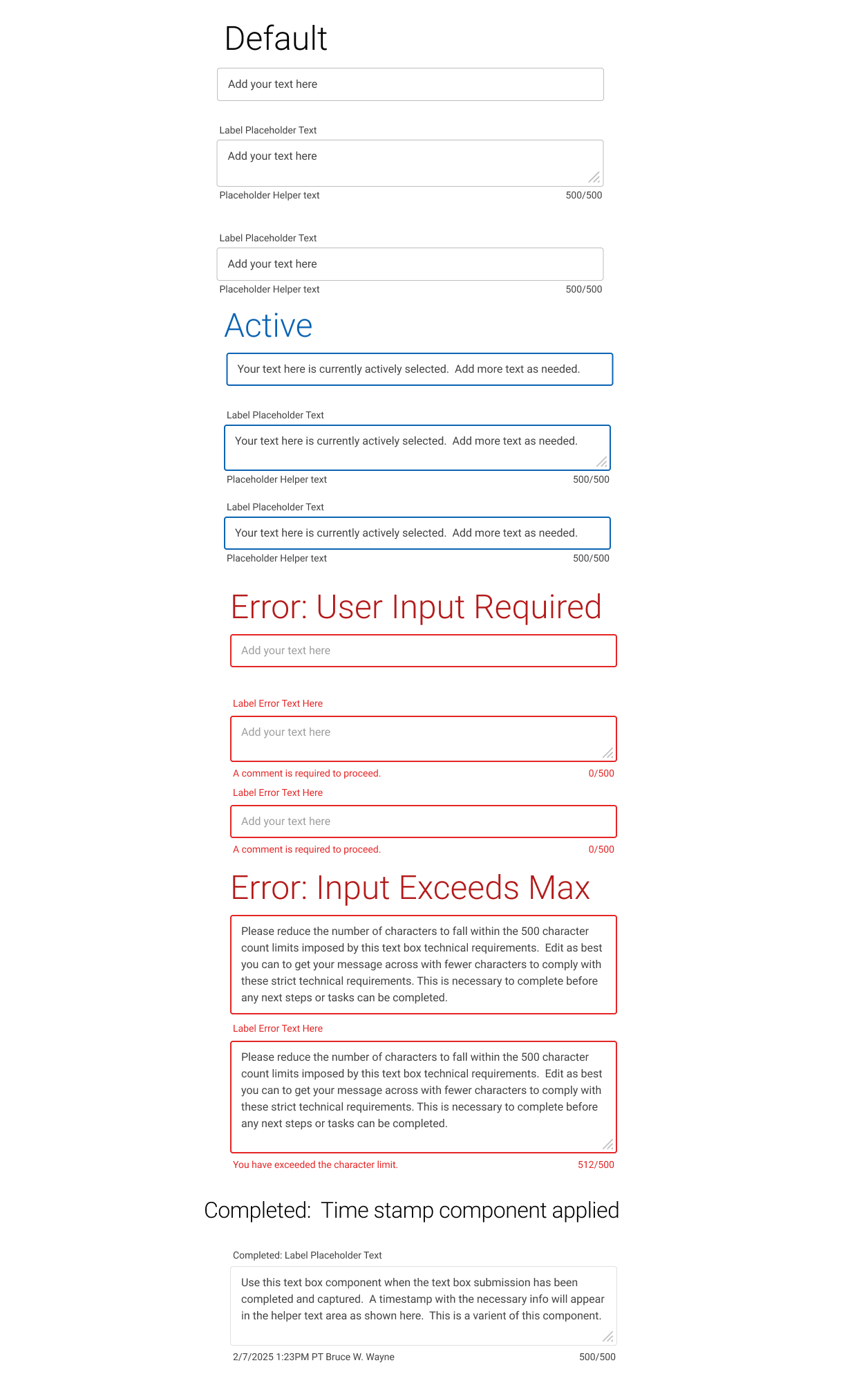
I create functional components with the intended interactions built into the component. This sets the expectations across all design teams, dev teams, product teams, quality assurance testing, and allows for metric tracking for reporting and business needs.
In the Figma Prototype below, the documentation and components are fully functional and can be easily added to new product designs with all state management set and functional in Figma. This component feeds into Storybook and is the same in the UI Toolkit. Its source code is linked to this Figma Design System Component by various APIs directly into designer's files and developer's IDE and Storybook.
250+ React components with TypeScript support
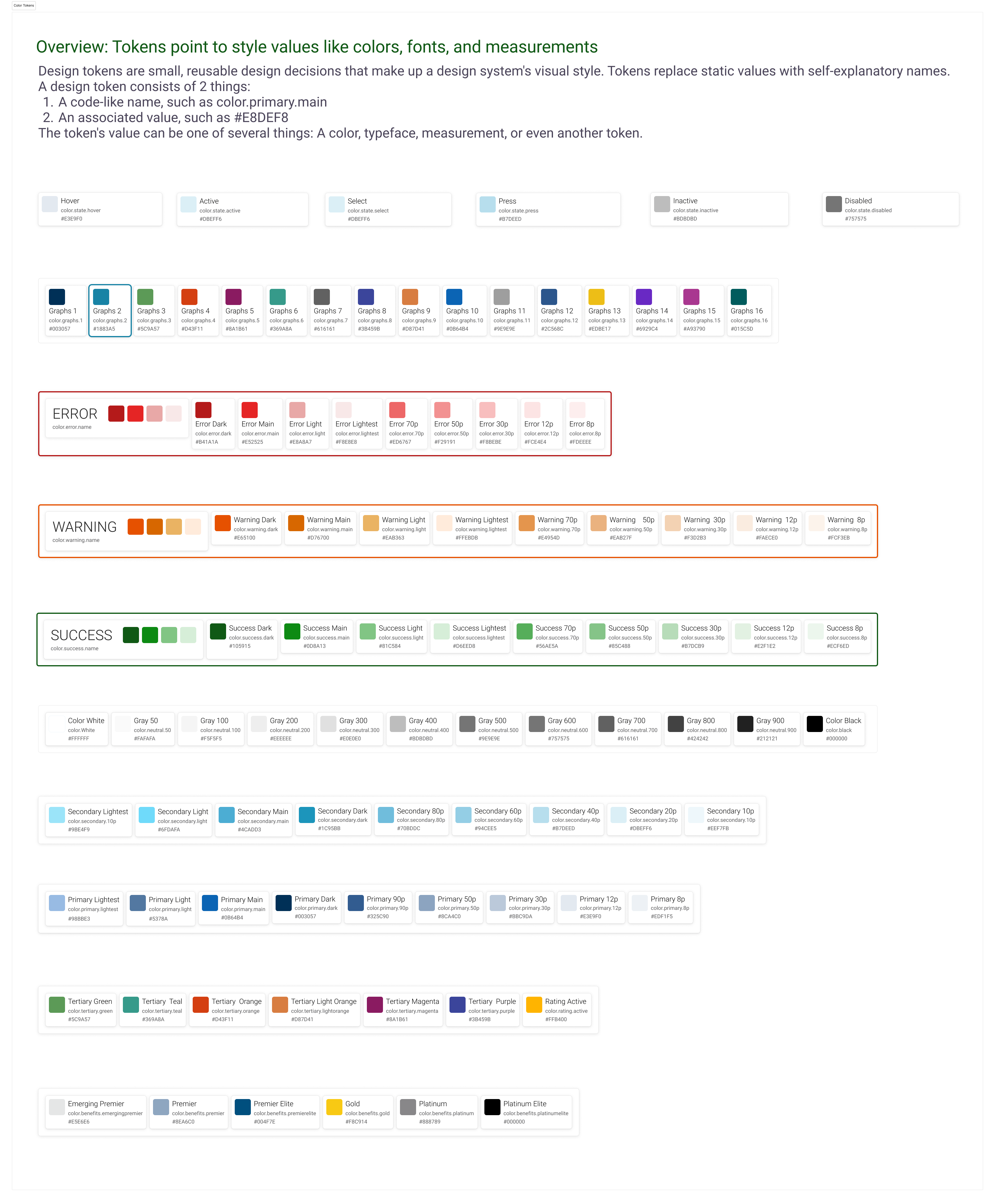
Centralized theme system with CSS variables
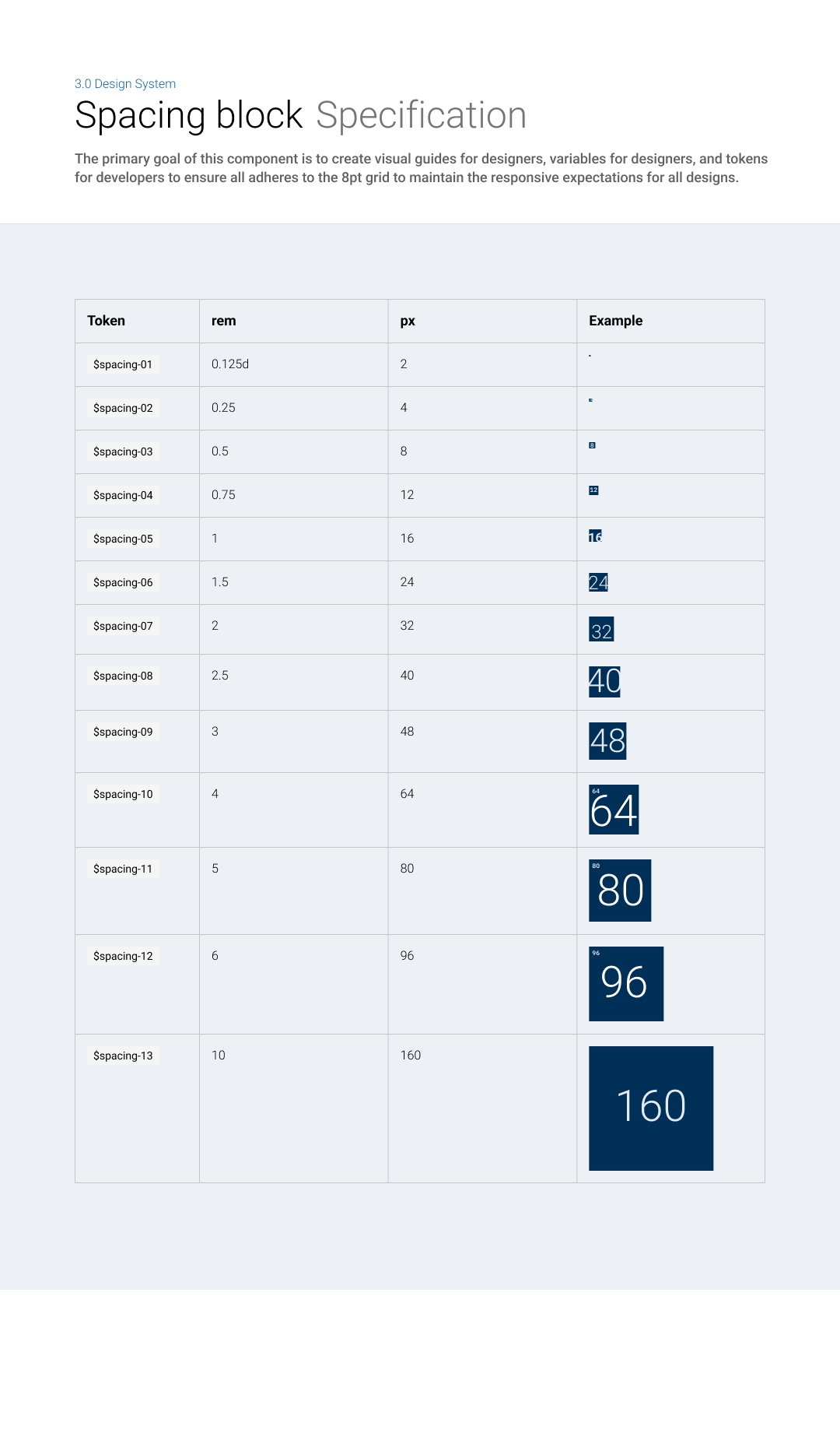
Centralized spacing system with CSS variables
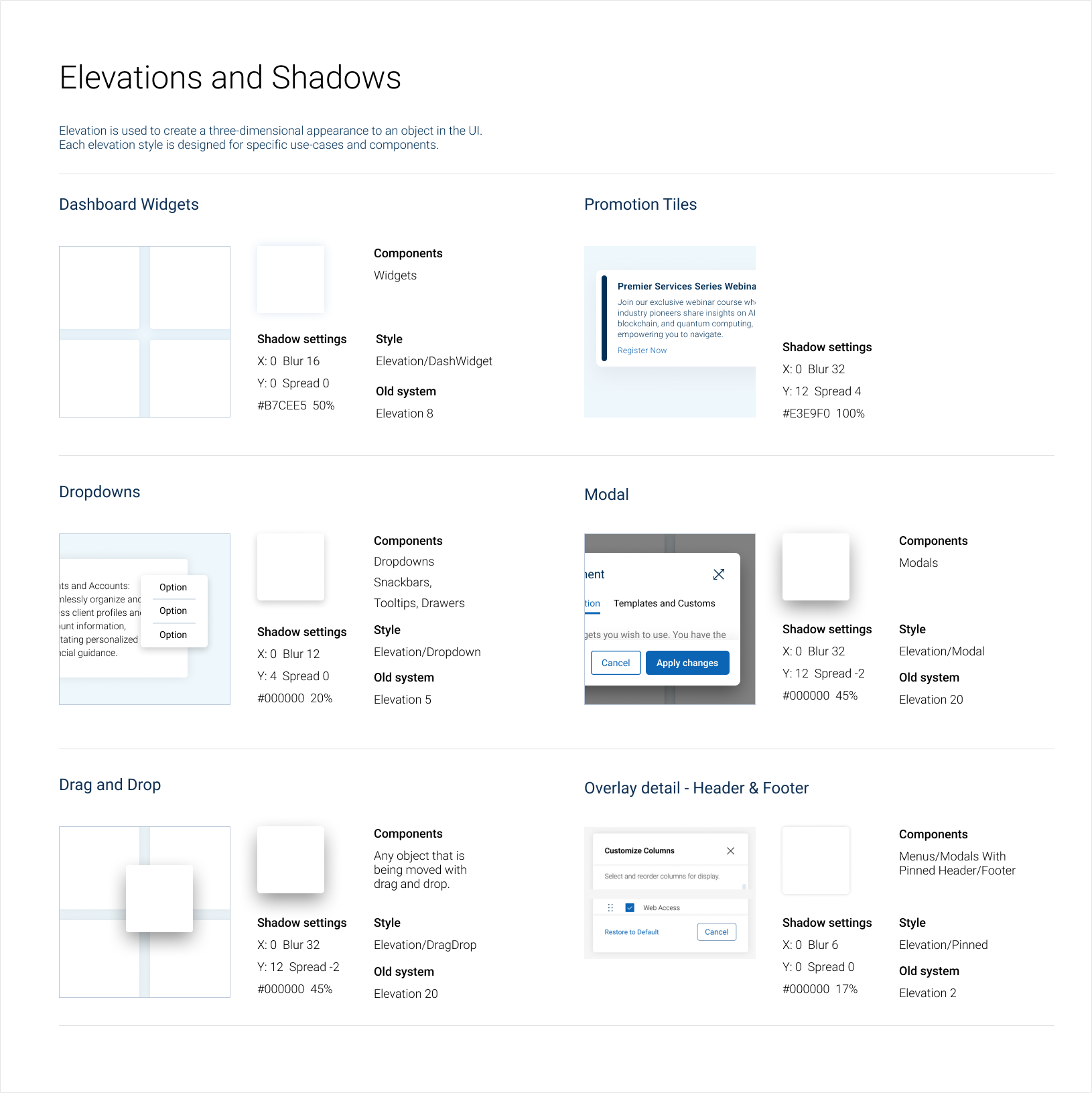
Centralized spacing system with CSS variables
Accept Terms Dynamic Component
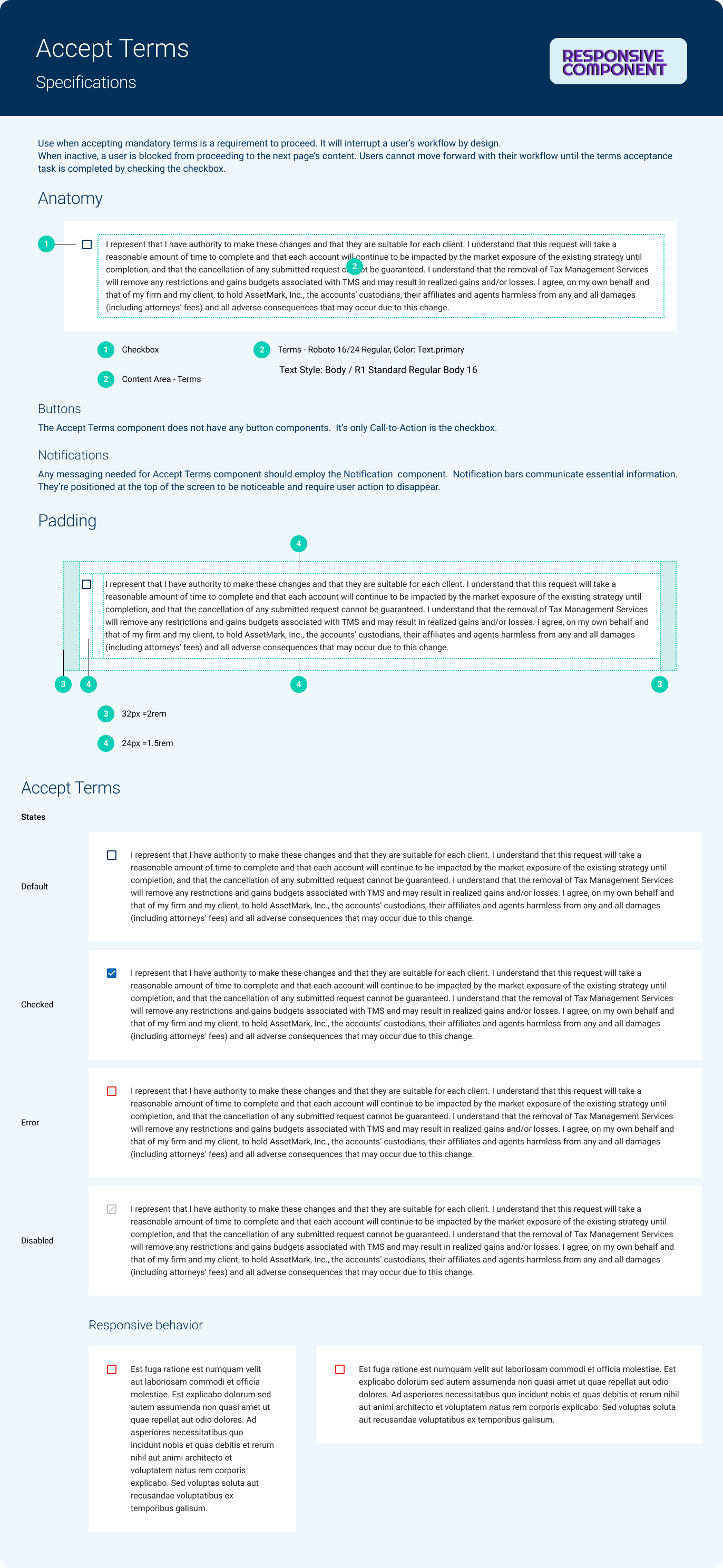
Centralized system with logic to work around form input limits
Comprehensive tools and resources that empower developers to build consistent, accessible interfaces. Having one source for all product owners, designers, and engineering including quality assurance, allows for faster delivery times and reduced bugs. It also can help with metric tracking for reporting and business needs.
By establishing and championing the Digital Design System, AssetMark gained not only a unified visual language but also a powerful operational advantage. This initiative not only streamlined internal processes but also laid a robust UI foundation crucial for the ongoing growth and successful delivery of high-quality, consistent digital experiences to AssetMark's expanding user base.
Continuing to evolve and expand the Digital Design System ecosystem.
Automated component generation and optimization
Aligning all teams and training designers to use the internal design system and Material Design 3. Expanding to React Native for Native mobile apps.
Usage metrics and performance insights
If you're looking to connect, let's grab a coffee and chat!
Here's some of what I'm listening to →
test