In this module we are going to and expand on everything we learned about floats in the last module. In addition to exploring advanced float techniques we will also take a good look at the CSS position property. Finally, we'll also take a look at coding data tables.
Tables are an important part of web design. They provide a simple solution for presenting tabular data. Tables are the basis for a myriad of web pages such as calendars, plane schedules, shopping cart pages, catalog pages, ticket booking applications and much more.
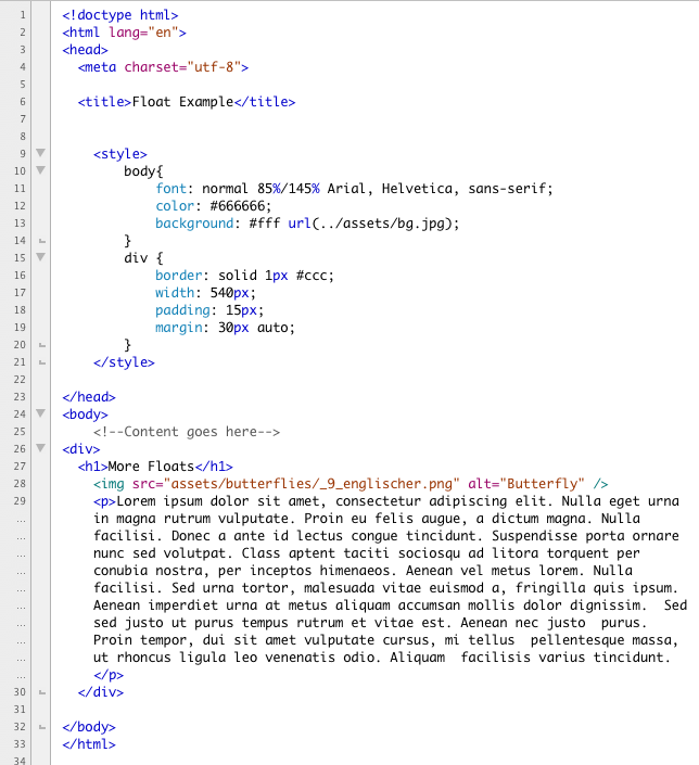
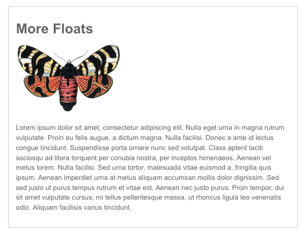
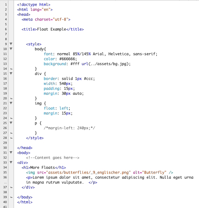
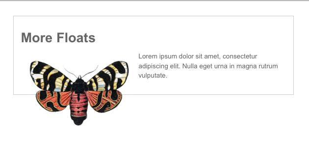
Floats are used in CSS to let two objects sit next to each other. A float pulls the floated object outside of the normal flow of the page and displaces the objects around it. Here we have a very basic page. It consists of a container div that is 540px wide and centered in the browser window. It contains a headline, and image and a paragraph of text. Here is the basic code:
And here is how it displays in a browser window:
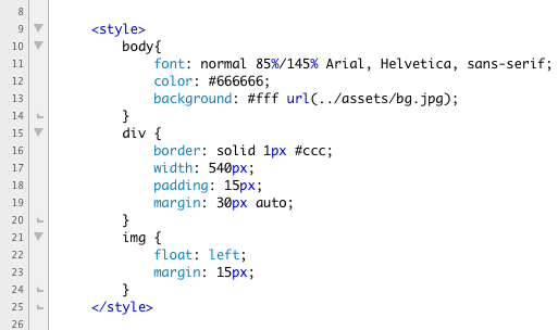
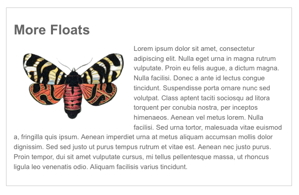
When we float the image to the left, the text wraps around it. Here is the code that floats it:
Here is the results in a browser:
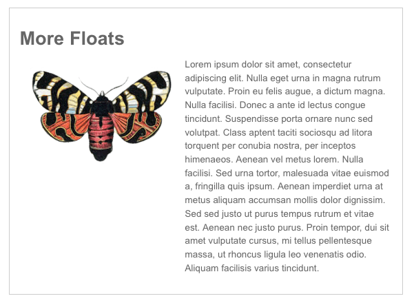
This looks great and is the expected behavior. If we want to force the paragraph of text to form an even column, we can add left margin to the paragraph like this:
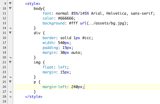
The result looks like this:
To start a new line after a float you would use the clear property to clear the float.
This all well and good and happy and we can savor our Kumbaya moment. Sadly dark forces are gathering and our joy is short lived. What happens if the amount of text we have with our image is truncated? What happens if the right column is much shorter than the right?
Here we've edited our text down to a fraction of what it was and removed the margin on the p tag:
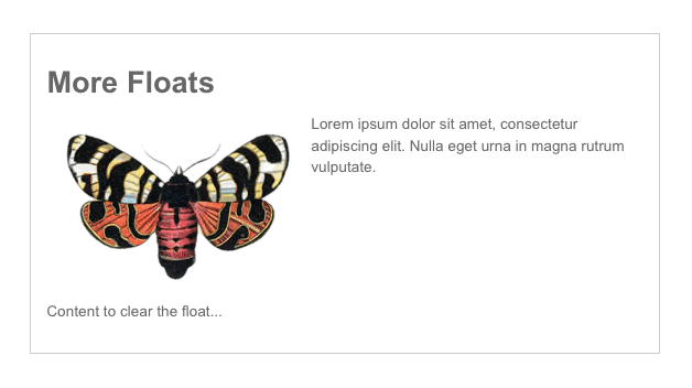
SAVE! When we open it in a browser we see that the float still works perfectly but the content is now falling out of the parent div!
This looks like a bug (and we're not talking about the butterfly) but it is the expected and proper behavior. The float disrupts the normal flow of the page. Now the parent div needs help. For the parent div to encase the content, it needs to have a cleared element.
We can write a "clearme" class and add a second paragraph to our content like this:
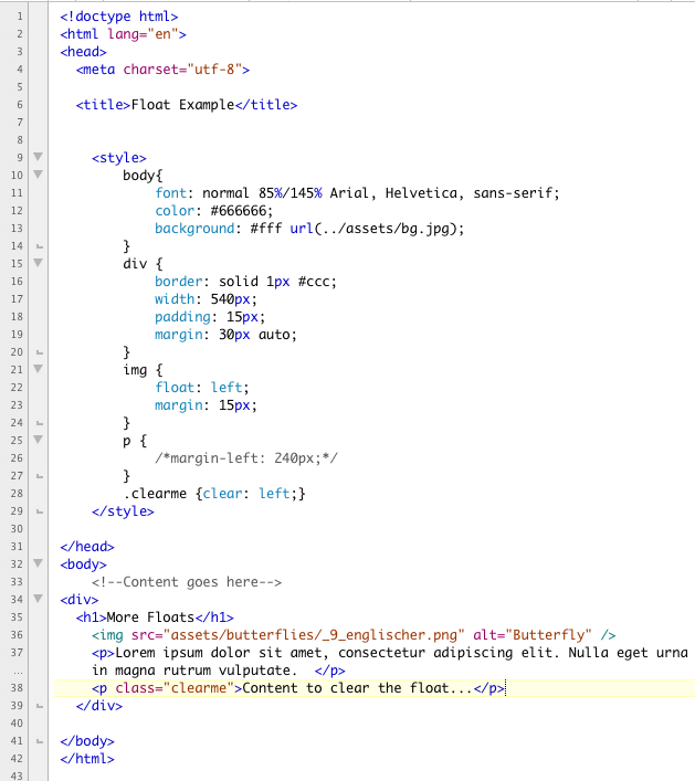
After saving, if we open this in a browser we see that the parent div is no longer confused and is able to wrap the content as expected. That's the good news. The bad news is we are stuck with a second paragraph.
This is well documented behavior and there bunch of different solutions. Another approach is to remove the extraneous p tag. A floated element can contain a floated element. So another solution would be to float the parent element. This effectively shrink-wraps the content like this:
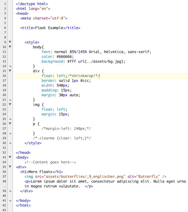
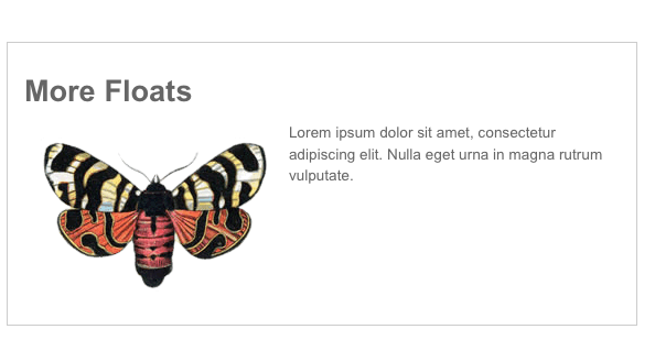
Once again our content looks great. This is a conveniently and commonly used technique. The biggest problem with it is we lost divs position on the page, it is no longer in the center of our browser.
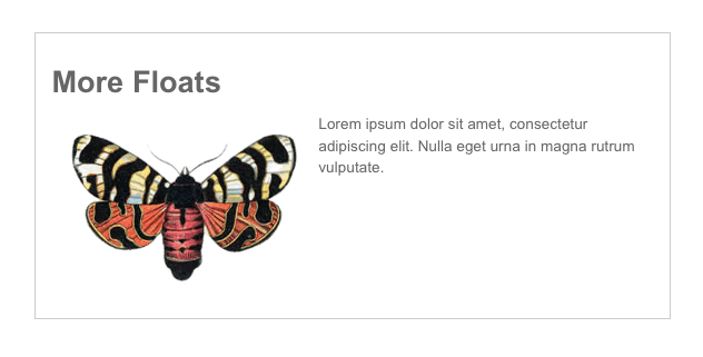
Another commonly used technique is escape the float by setting the overflow property to hidden on the parent element like this:
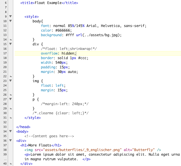
Now we've got the parent containing the content and centered in the browser.
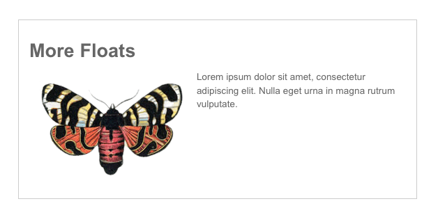
Another solution is to use the content property of CSS to add a new element after the p tag, set the new element to clear and hide it like this:
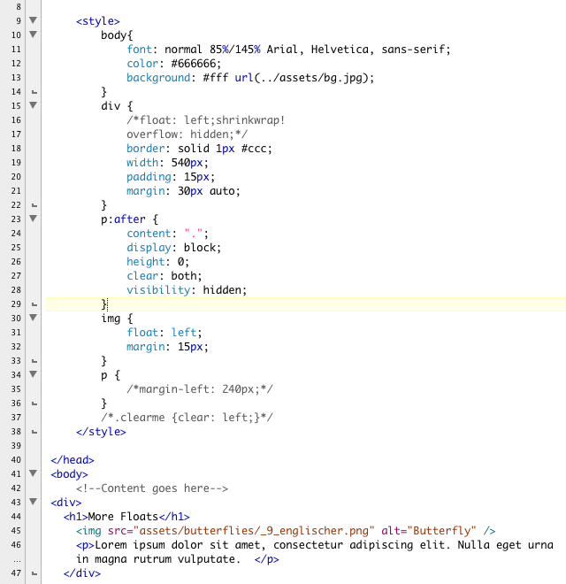
This adds an invisible period that clears the float after the p tag. Our page works great.
All of these are perfectly valid solutions. They all have their pros and cons. The one that is right for you will depend on your particular page and it's needs.
To learn more about floats check out the following article by Dan Stokes:
Duplicate your m5 folder from Module 5. Name the copy "m6_yourlastname". Find your m3 folder from Module 3. Copy the recipe.html file and paste a copy of it into your m6 folder. We are going to turn our attention to The Recipes page, a high level navigation for our recipe site. We are going to use floats to develop our page into a three a column layout. In addition we are going to add thumbnails of the different recipes to encourage our users to explore.
The complete this demonstration you will need the following images:
You can use the same list of recipes we used in Module 3, or you can vary names to suit your needs. When organizing a site like this, you can use file names to organize your folders. For the demonstration site, we have added a thumbs folder for the thumbnails and an an images folder for the enlargements inside the assets folder.
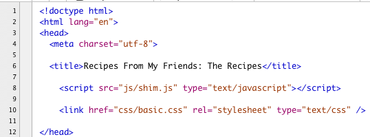
The first thing we need to do is update the HTML. Open recipes.html in your text editor. Tear out and old CSS and update the head to match the pancakes.html head. It should include a script tag to the shim.js file and a link to the basic.css file like this:
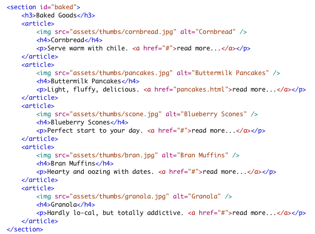
For each article tag add a thumbnail of the recipe. Here is the code for the Baked Goods section:
Here is the code for the Savories section:

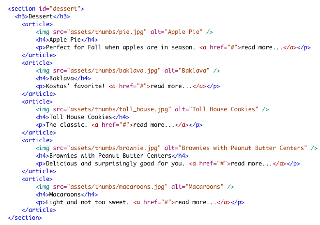
And this is the code for the Desserts:
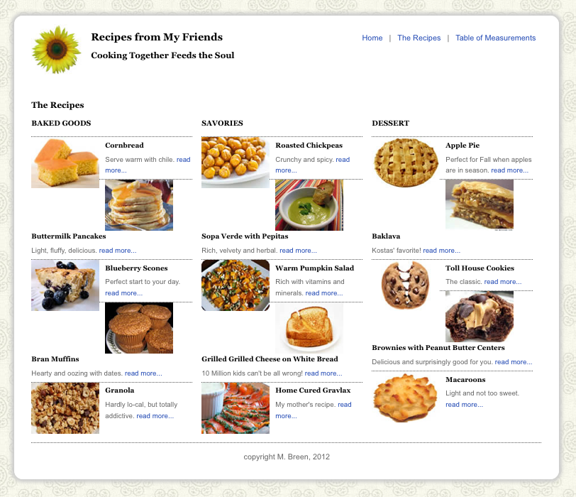
SAVE! When you open the file in a browser you will see all the tags update their styling to match the pancake demonstration we did in Module 5. Additionally, all the articles and sections will stack neatly on top of each other like this:
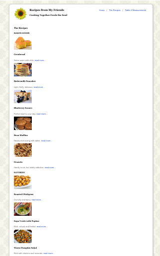
Converting our page to a handsome three column layout is ridiculously easy now.
Open basic.css in a text editor. Start a new section in your CSS for the navigation page. Remember you can always add comments to your CSS by using slash star combination like this:
/*This is a CSS comment*/
The first thing we will want to do is grab each our sections by their ids. We will float them to the left and assign them a width of 285px.
The first two sections, baked and savory, get right margins. The last column doesn't need a right margin because it is the last and furthest right.
While we're at it, let's make sure the section headlines, the h3's, are all at the top. Our additional code looks like this so far:

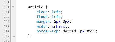
Next we turn our attention to the article tags. In our reset CSS we defined the article tag as a block level tag. Each article will contain a floated image, so the article itself will need be floated left to contain the floated image. Since the article tags are floated, they will also need to clear the floats. Line 140 clears the floats, Line 141 adds a float left to each article.
Then we add a bit of margin to the top and bottom of each article to give them a bit of air.
We set the articles width to "inherit" their width from their parent, which is the sections. The sections are 285px wide. We could also have set the articles' width to be 100%, it would have produced similar results.
Finally we add a dotted top border to each article. Our article style reads like this:
For both the h4 and the p tags inside the articles we give them a bit of top margin and set the size of the font down just a little bit.
For the img tags, we define them as block level tags using the display property. Then we float them to the left. Finally we give them a bit of right margin. Here are the final style:

SAVE! With just a bit of effort we have a handsome navigation page that features our recipes in a graphic manner.

The style for the article tags was a bit mysterious with it clearing floats and then floating left. A floated element can contain a floated element. If the parent is not floated, the child element tends to fall out. There are other fixes, but floating the parent is simple and doesn't gunk up your code too much. To understand this better, try commenting the float out of the article style like this:
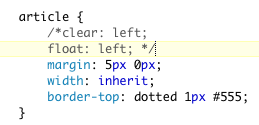
SAVE! The result is is chaos:
Restore your code and save.
Before we move on to tables, let's do a quick demonstration of CSS positioning properties. There are five positioning properties:
The most commonly used properties are the relative and absolute properties. They are frequently used in tandem with each other. To see this action, lets make a demonstration. We are going to set up a small scrolling slide show. We are going to do this in two stages. Today we will write the CSS. In our section on Javascript, we will return to this file and add the animation!
Duplicate your floats.html file and name the new file "positioning.html". Again our demonstration file uses PNGs of butterflies. Yours will be different. In addition to the images already on the page you need a graphics for a "back" and "next" button. Triangles and arrows work well, or you can use text.
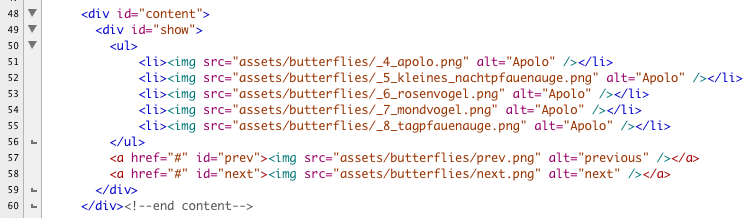
Remove the figure and the figcaption tags along with the captions. Convert your images to an unordered list.
Below the list, add the previous and next graphics. Wrap them in a tag. Use the hatch mark ("#") as a place holder in the href attribute. Give the previous button the id of "prev" and the next button the id of "next".
Wrap the both the list and the previous and next images in a div with the id of "show".
Your code look something like this:
We are going to completely rewrite the contents of the style tag in the head of our document, so you can remove all the styles from the float example.
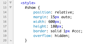
First we define the show div as a box 600px wide, 180px tall with a solid grey border. It has a top and bottom margin of 15px and is centered inside the content div.
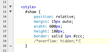
The position property is explicitly set to relative in Line 14.
Additionally we add the overflow property. The overflow property acts almost like a mask, it describes how content that can't fit in the box will be handled.
The style for show reads like this:
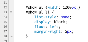
Our images are list items in an unordered list nested inside of show. First we give the unordered list a width so that all the floated li tags will have room to spread out.
For the li tags, we remove the bullet on Line 24 by setting the list-style to none.
We force each li tag to display as a block.
Line 26 floats the li tags into a horizontal bar.
And Line 27 adds 5px of margin between the li tags.
Here are the finished style:
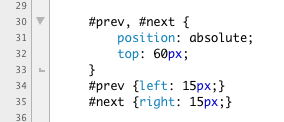
The previous and next buttons are where absolute positioning comes into play. We want the two buttons to sit on top of the images so that when they are presses, the images slide under them.
We set the position property of the back and next buttons to be absolute. We can now position them absolutely in relationship to their parent div, the div show. We set their top offset to 60px.
The button prev given a left offset of 15px. The next button is given a right offset of 15px.
Here is the code:
And here is the style tag in it's entirety:
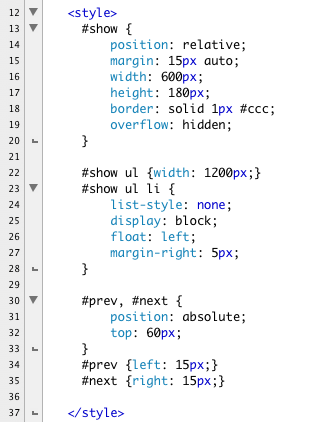
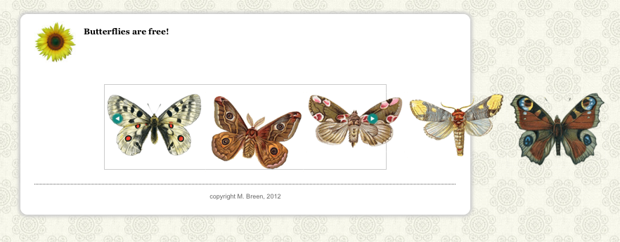
SAVE! When we open the page in a browser we see that the images fan out in a horizontal bar. The excess content is clipped off. The back and next buttons sit on top of the content and are absolutely positioned relative to the parent div.

If we were comment out the overflow property like this:
You would see the content spill out onto the page.
Restore the overflow property and save this file. We will return to it in a future module.
To learn more about positioning check out the following article by Dan Stokes:
Tim Berners-Lee's original vision of the Web was as a place where scientists could freely and easily exchange information. He thought of it as a collaboration. Because scientists were a among the first users, there was a need to show data tables. Tables have been part of HTML from its earliest days. They were first introduced in Netscape 1.1.

Netscape 1.1 (1995)
Web pages at this time were very simple. They were single column pages, with the column 100% of the width of the browser with a couple of text links. Designers were understandably bored with the medium, and the Web had a reputation for being flat out ugly.
Tabular data is data organized into rows and columns. Spread sheets are tables for holding data. HTML respects this division and provides a compliment of simple tags and attributes to achieve a rows with columns layout.
Tables create rows and columns of cells to organize the data displayed. Instructions can be given to size the table, but ultimately the table size and shape is controlled by the content it contains. Tables automatically adjust -- they stretch to hold all the content and then contract when the content is removed. Tables obey the cell content. If there is a dispute between size or dimensions of a table or cell and its content, the content wins! Tables can be styled with CSS.
Here is a list of the relevant tags:
Writing the code to create a table is very straightforward. The one thing you must be careful of is to make sure that every row has the same number of cells. The cells create the columns. You can add as many rows as you need. Let's see this in action. If you like you can follow along by opening your text editor and copying your template.html file. Name the new file "table.html".
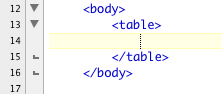
Inside the body tag, create a table. Open and close a table tag like this:
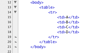
o create a row, use the tr tag. Within the row use the td tag to make the cells. For this first example use the border attribute so that you can clearly see the delineation of the rows. In the future we will replace this attribute with CSS but for now, the border will help you visualize the code.
Open and close a tr tag. Nest inside the tr tag four td tags to create the cells. Place a letter inside each cell. Here is the completed code:
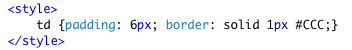
So our page doesn't look too brutally ugly, lets add a bit of style to the head of the document:
Here is what the code looks like in Firefox. Notice the tr tag makes a single row and the four td tags are nested in the row side by side.

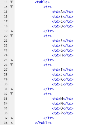
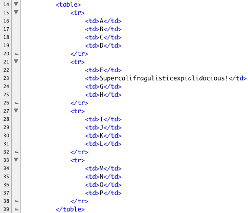
To see the columns, let's add more rows. Add three more rows, and nest four cells in each row. Place a letter in each cell. Below is the completed code. (Here's a nice tip -- copy the first tr tag with it's nested td tags. Paste three more copies and change the letters. Life is short.)
Here is the entire page:
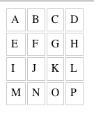
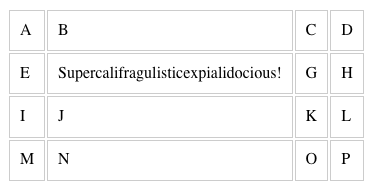
And here is how it renders:
Remember what we said about tables being stretchy and the content controlling the size of the table? Pick a cell -- here the "F" cell is used -- and add some extra content.
When you re-check the table in Firefox you see that the second column has stretched to accommodate the extra content. All the cells in that column have stretched to keep columns aligned. This is the natural behavior of tables. If your table is doing something different, your table is broken -- go back and recheck your code.
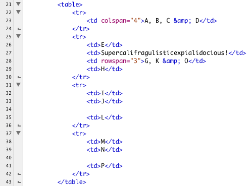
It is possible to join cells across both rows and columns. It takes a bit of surgery, but it is in concept very simple. To join cells across a column, you would use the colspan attribute. You are spanning cells across a column, hence the name "colspan." The colspan is an attribute of the td tag. You add the colspan attribute and tell it how many cells you are collapsing into one. Then you remove all the extraneous cells. This is one of the most common places for tables to break -- either the number of spanned cells is incorrectly entered or the developer took out the wrong number of cells. Either way the results of a botched colspan look nasty.
The A, B, C and D cells are collapsed into one. Notice the removal all the extra td tags. Here is the code:
CSS provides extra support for tables. The border property has a variation that states what happens when two cells are next to each other. The border-collapse property allows you to either collapse borders next to each other or separate them. If you choose to separate them, you can control the space between cells with the border-spacing property, like this:
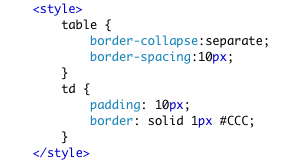
The results are as shown below:

Let's put this into action. Duplicate pancake.html. Name the copy "measurements.html"
Keep the subnavigation and the section tag with the id of "recipe". Remove the contents of the recipe section.
Add a new h1 tag and name the page Table of Measurements. For the purposes of this demonstration we are building a table that compares American units of measurement with Canadian and Australian. You can use different data if you like. We found ours at:
Open and close a table tag.
The first row contains the table's header information. Instead of tds, we will use th tags in the first row. We have three columns.
After that, we have a march of tr tags with nested td tags down the page. Below are the first five rows of 23:
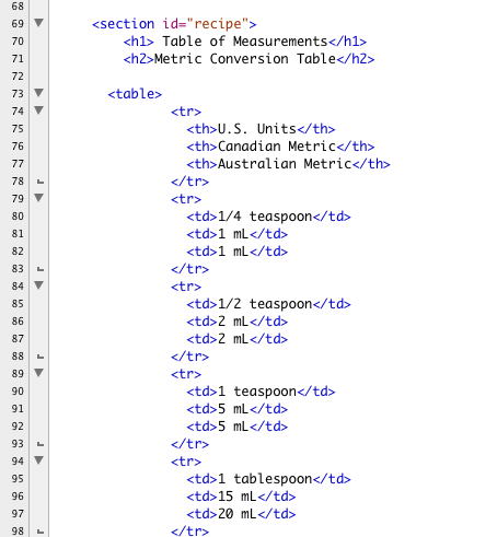
And here are the last two rows. This screen shot also shows the closing of the table and the attribution:

Writing these kinds of table is fiddly work, but the real magic is in the CSS.
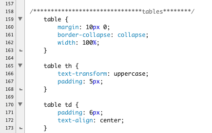
First we give the entire table a bit of margin in the top and bottom.
We collapse the borders so there is no space between the cells.
The width of the whole table is 100%.
For the table head that labels the columns, we set the text to display in upper-case using the text-transform property. We give the cells a bit of padding.
The cells themselves get a little padding and center the text.
Our table looks good enough, but it's a little hard to read. It would be nice to zebra stripe our table. Tinting every other row would do our table a world of good. CSS provides a simple way to do this without cluttering up our HTML. We can take advantage of one of the new CSS pseudo classes.
The nth-of-type() pseudo class will grab what ever type of tag you attach it to and style all like tags at the interval you specify inside the parenthesis. Using the keyword "even" will style every other tag starting with the second tag. If we attach it to the tr tag we can tint every other row.
Our code for the zebra striping looks like this:

We now have pale tan zebra striping. Adding vertical divisions would finish this table off nicely. We could just set the border property on all our cells, but it would be sweeter if we just had the verticals where we needed them, on the middle column to separate it out visually from the left and right column.
Once again we can use the nth-of-type() pseudo class. This time we add it to the td tags and use it to add a right and a left border like this:

Here is the completed CSS:

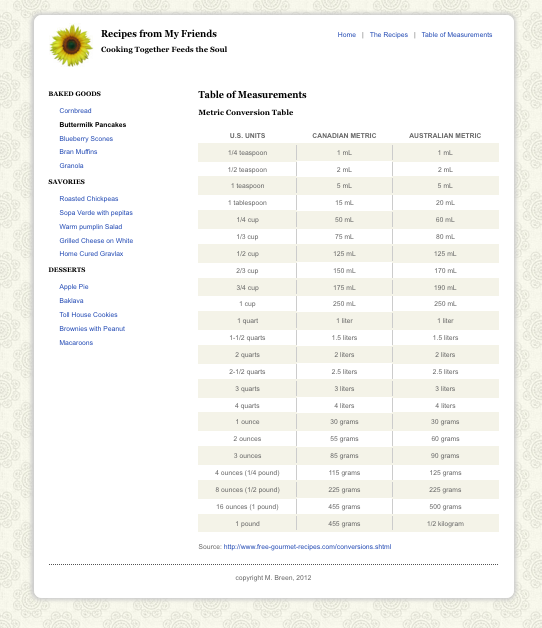
SAVE! When we open our page in a browser we find an elegant, readable table.
Please re-create the following demonstrations of the CSS float property, the position property and the HTML table tag:
The purpose of this assignment is to review the CSS float property and it's usage in web layouts, to understand positioning and tables:
This assignment is due by the end of Module 6.
Place all of your files in a folder, and name the folder m6_yourlastname. Upload your folder to your server space. ZIP the local copy of your folder. Post the URL to the appropriate topic in the Class Discussion, and attach the ZIP of the folder.
Use the following file-naming convention:
- m6_yourlastname.zip
Overview
We have been writing XHTML and CSS from the very beginning of the course. We have also been learning about the Web as a unique design environment. In this project we are going to bring them all together to create a website. All of you have put together a recipe for your demonstration files. For this site you will collect all the recipes from your fellow students and collect them into a finished website. Your site will include the following pages:
You will need to organize all of these pages into a maintainable website. I recommend that you keep the folder structure simple. Place all the HTML pages into a folder with an assets folder for the images. Your sites will require navigation. In the modules we use a two-column layout with utility links at the top and local navigation on the left. You can stick with this system or come up with one of your own.
The look and feel is also up to you. You can re-shape and re-design the recipes that you get from other students. Feel free to experiment with imagery, icons, colors, and typography. CSS is to be used for all styling and positioning. Tables may be used for tabular data only.
One of the big issues you will need to resolve is how to handle the background image. In my example, I used a head of cabbage. Obviously, this will not be appropriate for many recipes. There are many design solutions here. You could have:
Project Breakdown
Description
Make the Comparative Table of Measurements. Add navigation to all your pages. Link all your pages. Continue to refine your CSS. Finish preparing graphics. Begin page clean up.
Purpose
Tools
Due Date
By the end of Module 6.
Submission Directions
Put your files in a folder. Name your folder "project1_yourlastname". Upload your folder to your server. ZIP the local copy of your folder. Post the URL to the appropriate Discussion topic and attach the ZIP of the folder.
Description
Throughout the semester you will be building demonstration files. By the end of the semester you will have a sizable collection of pages demonstrating different skills. For your Midterm you will collect all the demonstration files from the first half of the course into a single site. Your site will need a home page that describes and links to every demonstration. The individual demonstrations need not link to each other.
You home page must include:
Organize your demonstrations into folders. Organize the folders in a way that makes sense to you. I suggest you keep your folder structure as flat as you can.
Use HTML and CSS to make your page. Design your page and make it into something special! Don't be afraid to have fun with page. You can add thumbnails, background images, personal logos, icons, wacky colors, goofy type -- just so long as it's legible. Have fun.
Validate your code. Make the necessary corrections. Upload your recipe to your web server space and post the URL to your Demonstration Library in the Discussion.
You will be updating this page again at the end of the course. As part of the Final you will be collecting and adding all the demonstrations from the second half of the semester.
Purpose
To gain practical experience working with structured content and using HTML to express the structure.
Tools
Due Date
By the end of Module 7.
Submission Directions
Put your files in a folder. Name your folder "demo_library_yourlastname". Upload your folder to your server. ZIP the local copy of your folder. Post the URL to the appropriate Discussion topic and attached the ZIP of the folder.