
With CSS the web designer has a wonderful tool for controlling every aspect of how the page design is implemented. In the past, browser support for CSS has been spotty and inconsistent. It was very difficult to create pages that looked good and worked well in all the major browsers across different platforms. Modern browsers do a much better job of consistently honoring the designer's instructions. In the future, browser support for CSS will only get better.
Positioning in CSS is deceptively simple in concept. There are only a handful of relevant properties. Here is a review of the properties:
Before you can really understand CSS positioning, you need to have a firm grasp of "normal flow". Normal flow is defined by the W3C recommendation for HTML as:
"Boxes in the normal flow belong to a formatting context, which may be block or inline, but not both simultaneously. Block-level boxes participate in a block formatting context. Inline-level boxes participate in an inline formatting context."
You can read the full referrrence in context at: http://www.w3.org/TR/CSS21/visuren.html#normal-flow
What this means is that boxes drawn into your page must be defined as either block level of inline. Block level elements stack up one on top of the other. Inline elements sit side by side. Positioning in CSS disrupts the normal flow of a page.
You can think of CSS as drawing boxes within boxes, like an elaborate bento box. There is a place for everything and everything is in its place. The child boxes inherit their position from their parent boxes. This chain of inheritance is part of the cascade.
Block level tags start a new section within the page. They add a line break as part of their natural behavior. Left unchecked, they tend to default to 100% width of their parent and will stack one on top of each other. If you want to break this pattern and allow the block level elements to sit next to each other you use the float property. As long as there is enough width in the parent element, floating a group of block level elements all in the same direction allows them to line themselves up beside each other. This is how column layouts are created.
Let's see this in action. Duplicate your m4 folder and rename it "m5_yourlastname". Duplicate the pancake page demonstration from Module 4. Rename the new file "floats.html".
For this demonstration you will need five images with transparent backgrounds. In the demonstration file we used lithograpghs of butterflies from a German Natural History book that we found on Wikipedia. We removed the background and optimized the images as PNG8s with the alpha preserved.
Open "floats.html" in your text editor. Remove the recipe section from the content div.
Edit the title tag and the header tag to suit your content. Our content for the demonstration file is butterflies.
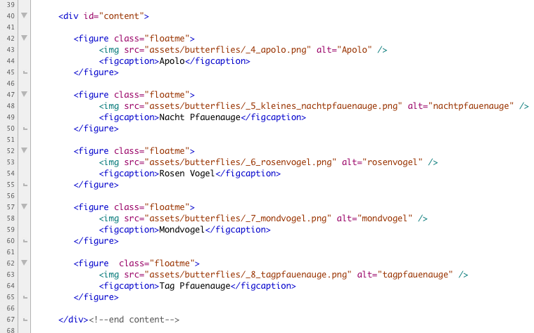
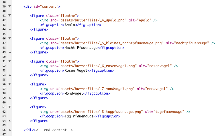
To the content div add your images. Wrap each individual image with the figure tag. Inside the figure tag nest a figcation tag with the image. Add a caption for each image. Be sure to close the figcation tag!
Your image names and paths will differ from the example below but your content should look something like this:
SAVE!
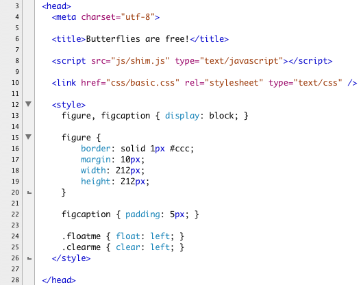
We are going to write some styles for this page and this page alone in the head of our document. Under the link to the basic.css file open and close a style tag. We are going to write some basic styles to demonstrate floats.
The figure and figcaption tags are new tags, not all browsers will know how to display them. We did add them to our Javascript shim, but we need to explicitly state how we want them drawn. Set figure and figcaption to display as "block".
Both figure and figcaption are now rendering as boxes. Add a border to figure so you can see its position clearly. Give it a margin, a width and a height. The numbers below reflect the size of the demonstration images, your may differ.
Give figcaption a bit of padding so the caption isn't jammed up against the edge.
Create two classes, one for the float and one for the clear. The first class name "floatme" and set the float property to float left. Name the second "clearme". Set the clear property to clear left.
here is the completed styles:
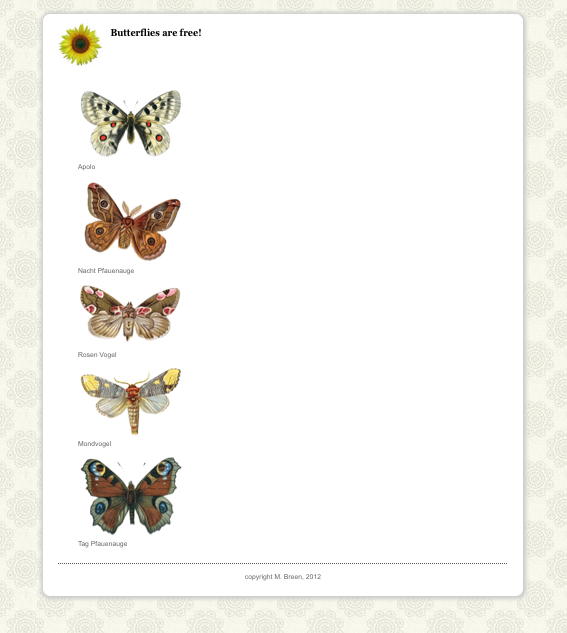
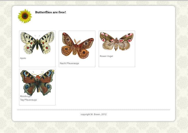
And here is how our page displays. We have not applied the float or the clear yet so the boxes just stack one on top of the other.
Add the floatme class to all the images like this:
SAVE! Open your page in a browser and you see the images sit next to each other nicely. When their width as a group exeeds the width of their containing element, they wrap.
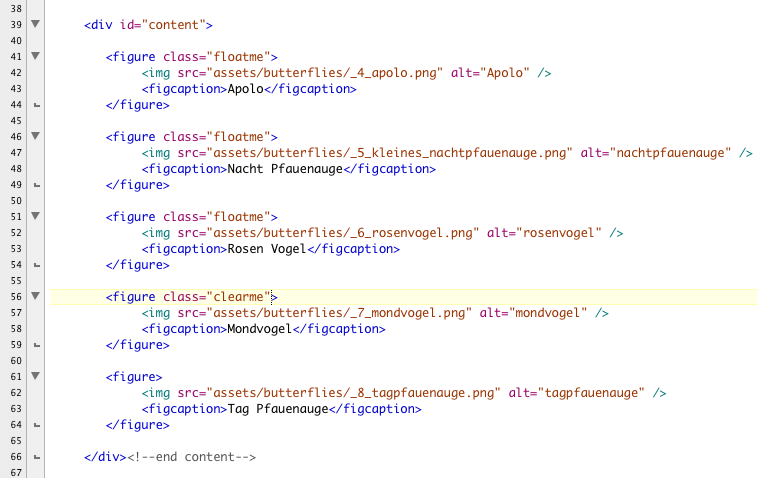
So far, so good. Remove the floatme class from the last two figure tags like this:
SAVE! When you open the page ina browser you notice something odd. The first three images continue to float nicely, but there appears to be only four images when before there was five!
Look more closely at that last image. You will see that last two images have piled up on top of each other. This is because we didn't clear the float and the first figure after the float is confused.
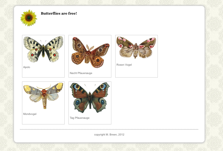
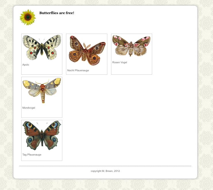
Add the clearme class to the second to the last figure tag.
SAVE! When you open the page in a browser you will see the expected behavior. The three images with the float sit next to each other. The figure that is cleared starts a new line and the figures that are not floated stack one on top of each other as expected.
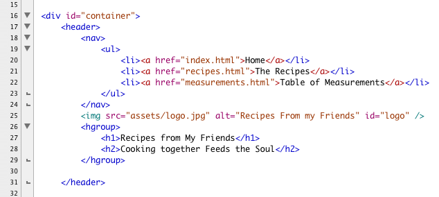
Let's take our lowly recipe and turn it into a more fully functioning web page. We want our recipe page to become part of a larger site. For that we will need to add navigation. The global navigation will go in the header of our page with the branding.
For the recipe we will go to a two column layout with the subnavigation in the left hand column and the recipe in the right.
Here is a layout for a well structured functional page:
Here is an annotated version of the layout. In it you can clearly see the boxes and how they sit next to each other.

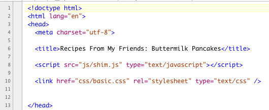
In your m5 folder you should already have a copy of your recipe demonstration file from Module 4. Open it in a text editor. Make sure that the head is correct and that there is a script tag pointing to shim.js in the js folder and a link to basic.css in the css folder. Double check both the js and the css folders and make sure the files are available. The hesd of your document should look something like this:
Our recipe file from Module 3 had the global navigation in it as a unordered list wrapped in a nav tag. We removed it from the demonstration file for Module 4. It's time to put it back in place like with placeholder links:
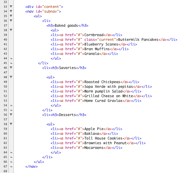
The content div currently holds the section woth the id of recipe. Above the section tag we are going to the subnav to the content id. When you build out your own recipe site your subnavigation will reflect the actual recipes that you have recieved from your fellow students. You may even come up with a site design that doesn't require subnavigation. For the purposes of this demonstration you will need it. Here is a text file with the dummy subnavigation we used in this demonstration:
As you can see it is a list of links organized into three groupings. I makes sense to present these as a nested list since that is what they are in fact. Below is the nested list. Notice that the a tags have a simple hatch ("#") mark in the href as a place holder. The link to the Buttermilk Pancakes has a class named "current". We are going to define the current class to emphasis the name. We will use it to give our users a visual cue as to which page the user is viewing.
Here is the completed list:
SAVE! The rest of our HTML is fine the way it is. All of our work will be in the CSS.
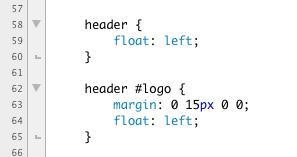
Open the CSS. The first part of the CSS remains unchanged. But now we're in a position to understand the mysterious treatment of the logo. The logo is floated left of the hgroup. We also floated the entire header tag to "shrinkwrap" the entire contents of the tag. This is a bit CSS slight of hand to make sure that all the floated elements don't fall out of the header.
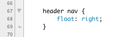
The entire nav tag inside of header gets floated to the right like this:
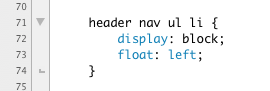
We want to turn our list of three links into a horizontal nav bar. We start by converting each li element into a block by using the display property.
Then we take the blocks and float them left like this:
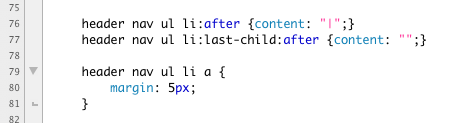
Time for more CSS slight of hand! We would like to add a little pipe character ("|") in between each list item. Adding li tags just for the pipe characters is dumb. It makes our code harder to update and the pipe characters have no meaning in of themselves, they are a purely visual elements. Sounds like a job for CSS!
We are going to use two of the brand new CSS3 psuedo classes, the "after" and the "last-child" psuedo classes. We are going to use both of them with the "content" property.
The content property allows you to add short bits of content that are added strictly to enhance the layout and have no meaning in of themselves. Our pipe characters are a perfect example.
The after psuedo class attaches the properties after the selected element.
The last-child psuedo class grapbs the last element in group of multiple instances. A list is a perfect example. Attached to the li tag, it captures the last li tag.
To keep our a tags from getting squished together we add 5px margin all around them. The finished code reads like this:
Our global navigation and our subnavigation are in lists. We won't want either of these to have bullets so we turn them off by setting the list-style to none:
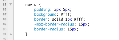
Just for fun, let's make all of our navigation links display as pill shapes when rolled over. Both of our global navigation links and our subnavigation links inherit from the nav tag, so we can leverage the cascade here.
We want the pill shape to appear on roll over. To set it up, we add a border and a background to the links with color set to makch the bckground. This hides the shape.
We also add the border-radius properties to create the pill shape. The fined style looks like this:
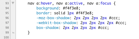
Then, for the hover and active states we tint the background color and add a tiny drop shadow using the box-shadow property.
In addition to the hover and active states, we add the focus state. This si for people who like to navigate their pages using a keyboard. As they tab through the links they will see the pill shape and know which link is in focus and ready to click.
The completed style reads like this:
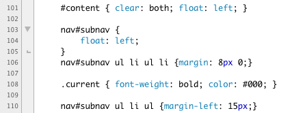
The header tag had a number of floated elements in it. Our content div will need to clear the floats. Because our content div also contains floated elements, we can float it left to be sure we completely contain all the content.
Our nested list items will need a bit more vertical space to accomodate the pill shapes so we add a bit of top bottom margin in Line 106.
Line 108 shows the current class that we are using to highlight the chosen page.
Line 110 adds a bit of indent to the nested unordered lists. Our style read like this:
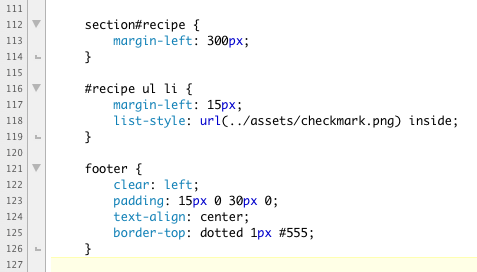
Now for the recipe section. We want it to sit next to the subnav, but we don't want it to wrap the subnav. Adding generous left margin will force the content into an even column.
The last piece of business is to fix the footer. We want to be sure it sits below the content div. So we add "clear: left;" to the footer stye.
Our additinal code reads like this:
Here is the completed text of basic.css in it's entirety:


SAVE! Open you page in a browser.
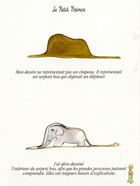
All graphics for the Web have to be downloaded from a server to the user's machine for viewing. Graphics files can get big and slow. Pulling all these big, heavy files is a lot like trying to shove an elephant through a boa constrictor.
Small is beautiful. But what does the term "small" mean? After all, we're talking about electronic files. When preparing images for the Web, these are three factors you need to pay attention to:
When we talk about the dimensions of an image we mean the image's width and height. Digital images are measured in pixels; for example, 800 pixels x 600 pixels. Pixels are the smallest visual units of a digital image. An image that measures 800 x 600 pixels has 480,000 individual pixels. Each of the those pixels has a tiny bit of VRAM dedicated to remembering how much red, how much green, and how much blue light to show.
It's important to realize that an image's pixel dimensions are not the same as its absolute physical size. The apparent size of an image is dependent on the specifications and settings of monitors, displays, and output devices. Monitors can be set to display different resolutions. At a higher resolution, the individual pixels are smaller, and images look smaller and clearer. With a lower resolution the pixels are larger, and images look larger and blockier.
The second factor to pay attention to is resolution, which is expressed as pixels per inch, or PPI. Resolution is a measure of the density of the pixel grid used to display an image. The amount of data required to capture and preserve the resolution of an image is independent of the monitor's resolution. The monitor displays the image. The resolution of an image refers to the density of the pixels. Higher resolution images require more data to display. The higher the resolution of an image, the more pixels are used to represent it, and thus the more details that can be captured and represented. Different media require different resolutions. A printed image, for example, requires a higher resolution than an image displayed on a monitor. If a browser can only display a resolution of 72ppi, then any higher resolution is a waste of the bandwidth required to send it.
The last factor to consider is file size. File size is measured in such units as bytes, kilobytes, and megabytes, and it reflects the amount of data stored in a file. This data is what is used to recreate your image onscreen. With digital image files, more data generally translates to greater detail and, potentially, to a crisper image. But remember that larger files will take longer to upload and download, so, when you're preparing an image, it's important to strike a balance between file size and image quality.
Image compression utilizes complicated formulas to systematically eliminate data, allowing you to reduce file size and yet maintain image integrity and quality. Many compression algorithms compare pixels horizontally. If there is a change in color, the file needs to encode that change and the files size increases. If there is no change, then the file doesn't need to remember anything and the files size goes down.
 |
 |
| File size: 1.14k | File size: 2.89k |
When compressing images you are constantly balancing file size with quality. Getting rid of too much image data can result in images that look "pixilated" or blocky.

There are four main types of compression used for compressing with web graphics. Which you choose depends on the kind of image you are preparing.
One of the largest factors in determining file size is the complexity of the image. To get a feel for the factors that affect file size we are going to compare details of four works of art. These details are 225 pixels square. These four images are all compressed using exactly the same compression — 75% JPG.
The first is a beautiful water color called Hecate by William Blake. It has a lot of rich color and a moderate amount of complexity. The detail is 14k, the enlargement is 650x465 pixels and 82.6k.
The second is a wood cut called The Four Horsemen of the Apocalypse by Albrecht Durer. This is a black and white image, no color at all. But this image is enormously complex. This work very much reflects the times in which it was created. It shows a lavish love of detail and the fine rendering of a intricate line work. This is a beautiful work art and totally unsuited to the Web. Its beauty relies on the fine rendering of details, and the technology just isn't there yet. A resolution 72ppi will never be able to fairly represent the beauty and complexity of a medium that relies on reflected light. It looks mushy. The detail is 52k, the full size image is 465x650 pixels and 259k.
The third painting is an abstract work called Untitled (Red) by Robert Motherwell. It is rich in color but radical in its simplicity. Again, this is a work of art that our technology simply isn't sophisticated enough to fairly represent. The emotional impact of the scale is completely lost as is a the surface detail of painting. It is reduced at this resolution and scale to looking anemic and incomprehensible. But it sure compresses well. The detail is only 4k. The enlargement is 489x650 pixels and is a mere 14.4k.
The last work is a painting with silk screen. It has a fair amount of detail matched with open space of color. The detail is 10k. The enlargement 650x376 pixels and 43.3k.
| Hecate by William Blake 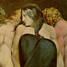 |
The Four Horsemen of the Apocalypse by Albrecht Durer 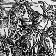 |
| Untitled (Red) by Robert Motherwell 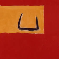 |
Golden Chalice by Robert Rauschenberg 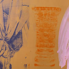 |
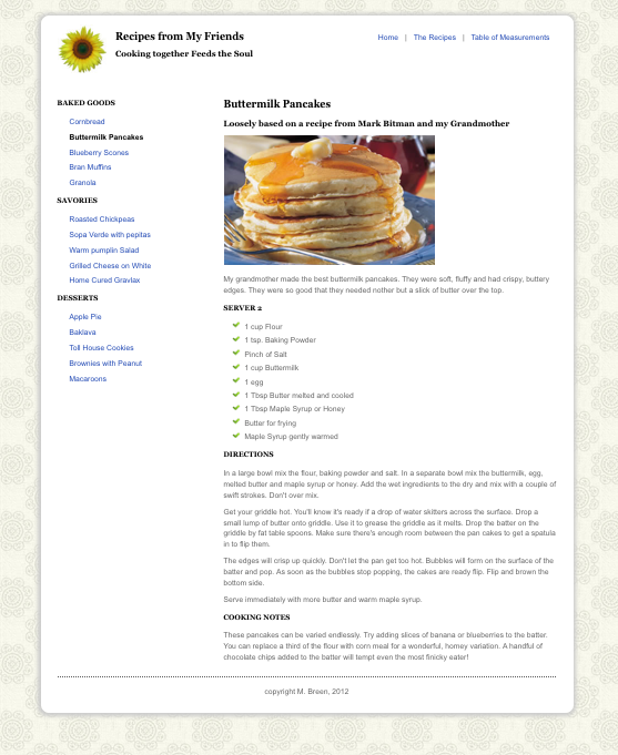
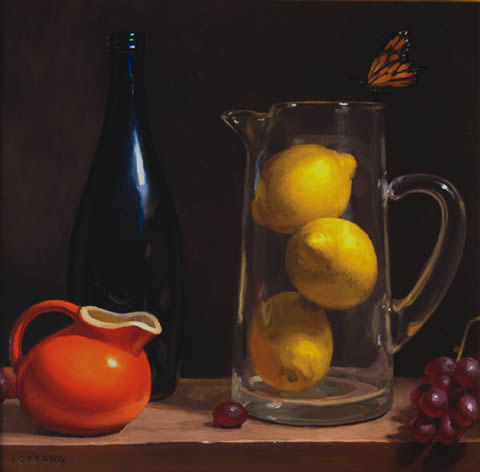
Once you have an image you like, it is time to prepare it for display on the Web. Below is a TIFF of a beautiful painting by Adam Forfang called Behind Glass. TIFF is a lossless file type used in print. Browsers can't read or display TIFFs. This image must be converted. All the screen shots below were taken in Fireworks. All of the techniques and options discussed below are available in Photoshop and called by very similar names. In most cases the programs use exactly the same names.
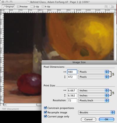
Here is a corner of the image at 100%. Open the Image Size dialog box. In Fireworks you access this dialog box through Modify > Canvass > Image Size, or deselect everything and click the Image Size option on the Properties panel. In Photoshop you can find it through Image > Image Size.
You'll notice that the Image Size dialog box is divided into two sections: Pixel Dimensions and Print Size, with a number of options available. You are interested in Pixel Dimensions. Print Size is meaningless on the Web. Ignore it. Make sure that the Resolution drop down menu is set to display in Pixels/inch. Be sure that Constrain proportions, Resample image, and Current page only are all selected. And chose Bicubic for the resampling option. Below you can see that the TIFF is huge and has a resolution of 300ppi.

We really don't need an image this large -- it's a waste of bandwidth. The resolution is reset to 72ppi and given a pixel dimension of 480x472 pixels.
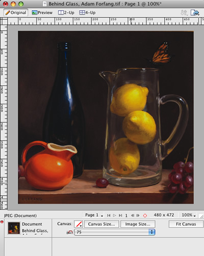
The image looks good at 100% -- clean and bright. It is ready for compression.
In Fireworks go to File > Image Preview, or click command + shift + x. In Photoshop go to File > Save for Web & Devices. Both programs give you the option to play with the different compression settings and view a preview of the results. Here you'll notice four possible compression settings. Since this is a photograph of a painting, the image has lots of nuanced transitions of color. There are complex textures that add richness. We want to preserve as much as possible so as not to flatten the image visually.
First we'll try a PNG. The file size is 51k -- not too bad, but not great either. The PNG is doing strange things to the color -- it is sharpening the color transitions, causing a look of banding that isn't in the original. It makes this lovely image look like a paint-by- numbers project. The JPG at 80% does a much better job. The color is bright and clear, the details are preserved, and the transitions respected. The file size is a respectable 25.3k. The JPG at 75% is also bright and clear. The details are a hair softer, but not so you would notice. At 20.66k, this file looks great. The JPG at 60% is starting look like someone sneezed on it. The details are mushy. Even though it's only 10.37k, the JPG at 75% is the best choice.

Another issue that comes up is how to make a proper enlargement and thumbnail. The point of making a thumbnail is to make an image that is small and lightweight as a "teaser" for a larger, heavier image. There is no point in annoying your users by forcing them to download big, heavy images before they are ready. Below is the full size image. It is 480 x 472 pixels, and 24k.
The full size image has been re-sized to make a proper thumbnail. It is now 75 X 74 pixels and only 4k.

Firebug is a wonderful tool for learning CSS from the best practitioners out there. With Firebug not only can you inspect the code, but you can edit any page on the Web locally. This allows you to toggle CSS properties and see how they really work.
When you choose the Inspect option in Firebug you are given the ability to select any element in the page. It will highlight. Right-clicking the element selects it. The underlying HTML displays on the left hand side of Firebug. The CSS displays on the right hand side. Only the styles that are applied to the element are displayed. Even better, they are displayed in the order of the cascade. They even show you which styles are being overwritten. Now that's useful.
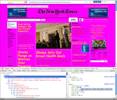
For example, here is the front page of the New York Times. I have opened Firebug. I have clicked the Inspect option and clicked on the body of the page. On the left, you see the HTML with all its scripts. On the right, you see the cascading styles.
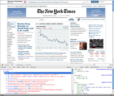
The inspect option is on the left hand side of Firebug where you will also see the edit option. Next to these two options you see the relevant HTML tags displayed in the correct nesting order.

Now comes the fun part. If you select the Edit option you can edit any element in the HTML or the CSS! This is a local display only, nothing on the server is affected. But if you truly want to understand how the cascade works, this is the tool for you.

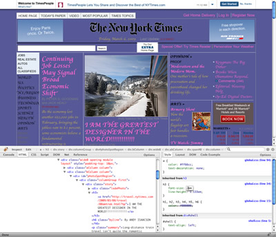
Don't like the news of the day? Write some of your own! While you're at it, go ahead and change the style sheet. Make it look like the designer was a drunk teenager on prom night. Ever wanted to read the New York Times in red Comic Sans on hot pink with yellow links? Now is your chance!
Please re-create the following demonstrations of the CSS float property and using CSS for page layout:
The purpose of this assignment is to lean the CSS float property and it's usage in web layouts:
This assignment is due by the end of Module 5.
Place all of your files in a folder, and name the folder m5_yourlastname. Upload your folder to your server space. ZIP the local copy of your folder. Post the URL to the appropriate topic in the Class Discussion, and attach the ZIP of the folder.
Use the following file-naming convention:
- m5_yourlastname.zip
Overview
We have been writing XHTML and CSS from the very beginning of the course. We have also been learning about the Web as a unique design environment. In this project we are going to bring them all together to create a website. All of you have put together a recipe for your demonstration files. For this site you will collect all the recipes from your fellow students and collect them into a finished website. Your site will include the following pages:
You will need to organize all of these pages into a maintainable website. I recommend that you keep the folder structure simple. Place all the HTML pages into a folder with an assets folder for the images. Your sites will require navigation. In the modules we use a two-column layout with utility links at the top and local navigation on the left. You can stick with this system or come up with one of your own.
The look and feel is also up to you. You can re-shape and re-design the recipes that you get from other students. Feel free to experiment with imagery, icons, colors and typography. CSS is to be used for all styling and positioning. Tables may be used for tabular data only.
One of the big issues you will need to resolve is how to handle the background image. In my example, I used a head of cabbage. Obviously, this will not be appropriate for many recipes. There are many design solutions here. You could have:
Project Breakdown
Description
In light of what you have learned about CSS, rework the look and feel of the recipe site. Diagram the page structure so that you know what you need to build into your code. Begin roughing out your code applied to your recipe. Start with one page and write a rough of your CSS. Pull the CSS out of your page and put it into an external CSS sheet. Link all your pages to the CSS sheet. Begin preparing graphics as well. Make an assets folder for all the graphics. Upload your coded page to your web server space. Post the URL in the Discussion along with your re-working of your page designs.
Purpose
Tools
Due Date
By the end of Module 5.
Submission Directions
Put your files in a folder. Name your folder "project1_yourlastname". Upload your folder to your server. ZIP the local copy of your folder. Post the URL to the appropriate Discussion topic and attach the ZIP of the folder.
Open up the the New York Times website and edit the news. Give the whole site a face lift by playing with the CSS properties. Let's see who can make the most outlandishly ridiculous page!
Don't like the New York Times? You can pick another comparably text heavy news site if you'd like. Here's my *beautiful* page:
Upload your screen shot to appropriate topic in the Class Discussion.
To gain practical experience working with structured content and using HTML to express the structure.
By the end of Module 5.
Make a screen shot of your *beautiful* creation. Attach the screen shot to the appropriate Discussion topic.